
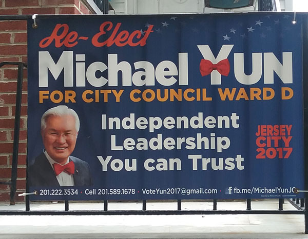
My city council member is up for re-election in November. His campaign sign is pretty much all over my neighborhood. (Local peeps: This e-letter is not an endorsement.)
The sign for the other council member on Michael Yun’s “slate” has exactly the same design, with one crucial difference.
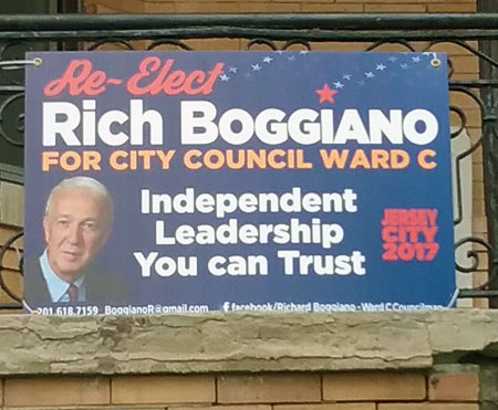
See the difference? It’s the bowtie on the Y in Yun.
The bowtie is a branding element for Councilmember Yun. His Facebook profile picture, for example, is a cartoon portrait consisting of white hair, glasses, and a stars-and-stripes bowtie.
People in Jersey City—in most cities, I suspect—can have trouble keeping track of local campaigns. Though Yun has a hefty advantage as the incumbent, three other people are also running for the Ward D council seat. Eight more are vying for the three at-large (citywide) seats. To be well-informed voters, people in Ward D have to keep track of 12 city council candidates.
So anything a candidate can do to set her- or himself apart is all to the good. Even if it’s a trivial thing like an article of clothing. Because it’s visual, that bowtie probably works better as a branding element than any number of policy statements or campaign promises.
Like Councilmember Yun, you are just one of many to most individuals in your target market. No matter how different you think you are, the people you need to reach probably just lump you in with the rest.
What can you do to stand out? A great logo – a visual, like the bowtie – is a good starting point.
Whatever visual elements you design, you have to use them consistently. In every photo of Yun I can find (except his daughter’s wedding, where he’s in Korean fancy dress), he is wearing a bowtie.
What can you do, today, to strengthen your visual identity? Check out ideas from the archive or contact me to chat.
Are campaign posters popping up around your neighborhood? Please share any doozies!